How often do you think about your real estate website homepage?
I spent the weekend reading real estate blog posts. Yeah, sounds boring, but it’s an occupational hazard.
Then, I happened upon one that was so brilliant, I about fell out of my chair. Titled “Why Snapchat is Crap for Real Estate Agents,” it was written by our very own Tyler Zey back in 2016. But, man, is it pertinent today.
No, it’s not all about Snapchat. It’s about agents chasing each new shiny object while letting the tried and true fall by the wayside. I’ll bet that happens in most industries, but it sure seems more prevalent in real estate.
Read it for yourself. It’s quite motivational and the yank back to reality you may be craving.
In fact, it has served as motivation for a series of posts we’ll be offering up over the next couple of weeks. We’ll be dissecting each of the most important pages on your website and reconstructing them in a way that will help keep your visitors engaged long enough to turn into leads. Whether you’re just starting out or an old pro, these posts will help you focus on what’s really important for your website.
Need a real estate website that works as hard as you do? Be sure to learn more about LeadSites.
Today, we start with real estate website hompages: The most important page on your site
The importance of your real estate website homepage
According to a study by Nielsen Norman Group, a visitor will leave your real estate website homepage within 10 to 20 seconds unless you give them a reason to stay.
“To gain several minutes of user attention, you must clearly communicate your value proposition within 10 seconds.”
Sounds like a tall order, right? But real estate website homepages are something far worthier of your attention than whether or not to be on Snapchat or any other social media site for that matter. After all, your social media efforts are meant to drive people back to your website.
If your site sucks, all that social media effort was wasted
Lose visitors here, where they land, and you’ve lost them forever. Your real estate website homepage is your curb appeal – your first chance to make such an unforgettable impression that they will register and they will come back.
Build stunning homepages that encourage exploration with LeadSites – Learn more here
Who is landing on your homepage and what are they looking for?
Knowing your audience is marketing 101 and figuring out who comprises your site’s audience is a no-brainer: a real estate consumer, either a buyer or a seller.
Naturally, a homebuyer wants to see listings, but that’s not all your visitors are searching for. A NAR study found that these visitors also crave information on the purchase process, from getting a loan to closing on the purchase. And many real estate website homepages don’t provide all of this information.
Homeowners thinking of selling want information about that process and, many visitors will be wanting to learn more about you, your services and what you’re like to work with.
To keep these people on your site long enough to convert them to a lead requires making your real estate website homepage the best it can be. Big believers in learning from others mistakes as well as successes, let’s take a look at some of the more common mistakes we see on agent websites.
Not customizing real estate website homepages
This is a biggie. We see it with our client’s sites all the time. Let’s start at the top of the page and work our way down.
Pull up your homepage and follow along.
Above the fold tweaks
The area that shows up before you begin scrolling down the page is known as “above the fold.” It’s your homepage’s most valuable real estate so not one inch of space should be disregarded.
The most common mistake we see with this part of the page is the absolute lack of the agents’ location. Most of the sites we viewed before writing this included the name of the brokerage, the agent’s name and his or her phone number and email address.
Aside from a handful of agents, all of the sites lacked any mention (above the fold) of where the agent works. None of them mention a city, a community or even the STATE that the agent serves.
What happened to the importance of “location, location, location?”
Where ARE you, Waldo?
It’s impossible to tell from the sites we viewed, until we scrolled to the bottom of the page. How many of your site’s visitors will stay put long enough to do that? And, where is the SEO value in not mentioning the city you serve?
Let visitors know, above the fold, that they’ve landed in the right place. The best way to do this is to localize the text that came with the site.
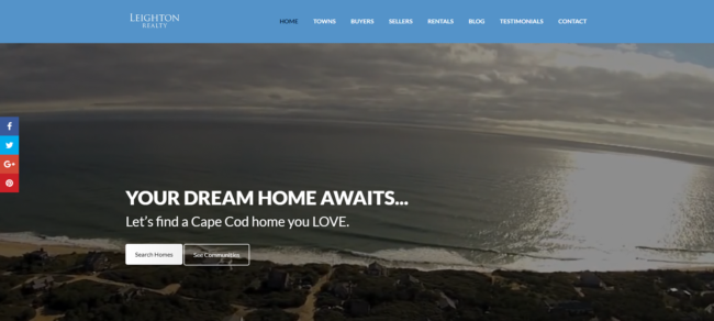
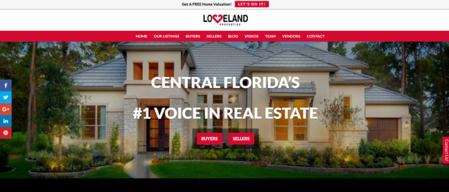
Something as simple as changing “YOUR DREAM HOME AWAITS” to “YOUR DREAM HOME IN ANWHEREVILLE AWAITS” will let visitors know they’ve found a local real estate site.
The same goes for “Work with me to find an ANYWHEREVILLE HOME YOU LOVE.” Check out this tweak in action on Cape Cod agent Michael Leighton’s homepage and also at lovelandreport.com, home of broker Cleve Loveland.
.
Scroll down your homepage and you’ll find plenty of other localizing opportunities that few agents are taking advantage of.
For instance, “SEARCH FOR HOMES” can be “SEARCH FOR HOMES IN ANYWHEREVILLE” and transform “Selling your Home” to “Selling your Anywhereville Home.”
The only way to beat the big, national real estate website homepages is by being LOCAL. Take advantage of this opportunity as often as possible.
Real estate website homepages – value proposition
Remember that Nielsen Norman Group study and the admonition to “communicate your value proposition” at the top of the homepage? Let’s figure that one out.
What is a value proposition, anyway? According to Investopedia, a value proposition “refers to a business or marketing statement that a company uses to summarize why a consumer should buy a product or use a service.”
The chances that someone landing on your real estate website homepage doesn’t understand the value of the IDX or the use of a real estate agent to buy or sell a home are slim.
But, there’s a second part to the definition: “This statement convinces a potential consumer that one particular product or service will add more value or better solve a problem than other similar offerings will.”
In other words, your value proposition needs to immediately show your site’s visitors how working with you is better than working with other agents in town.
And, the best way to get that across, in the least number of words possible, is with testimonials. Social proof is worth its weight in gold and does more than just show potential clients the value in working with you. Real estate website homepages shine with testimonials that increase your value proposition.
Testimonials also help establish trust
If you can’t squeeze in a one-line testimonial above the fold, ensure that your testimonials are the first thing visitors see as they begin scrolling.
If you’re the top agent in town, there’s your value proposition. Use it. Again, Michael Leighton gets bonus points. Here’s what his site’s visitors see as soon as they begin scrolling on his real estate website homepage:

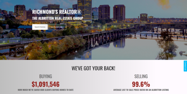
Take the first tip (localize your page) and add in the second tip (your value proposition) and you’ll end up with a page like this one, from The Albritton Real Estate Group in Richmond, VA (good job, Jake!):
Don’t be a stranger to your own site
If it’s been awhile since you checked your website for errors, now would be a good time to do so. Especially check for broken links, which will negatively impact your site’s SEO. Then, look for other odd errors.
We found several while scanning real estate website homepages. For instance, we have a feeling this agent hasn’t visited her site in awhile, because the problem in the nav bar (“PATH-DEFAULT”) is easily remedied in her site’s “Settings” area.
![]()
Then, there’s the agent who has a very cool video on his real estate website homepage. When it ends, YouTube offers up a preview of other videos for the visitor to watch.
The only problem is that the menu includes a picture of a naked lady. Not exactly the professional image the agent is trying to present, right?

Finally, if you haven’t yet obtained your SSL certificate for your website, do it now. As of July, of this year, Google Chrome started labeling non-HTTPS sites (those without a certificate) as “Not Secure.” Which site would you trust more? (courtesy of HostGator):
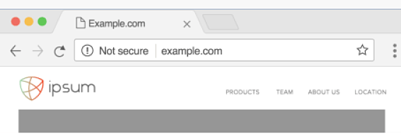
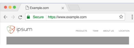
Although agents don’t take payments via their sites, they do ask for information, so the certificate will help protect the exchange of information.
Plus, It doesn’t do you any good to go overboard in your efforts to present yourself as trustworthy when, right there in the address bar, Google is telling them that you’re not.
Reach out to Easy Agent Pro support and we’ll take care of the process for you
Zillow’s research says that most real estate consumers find their agent via referral and only 3 percent find their agent via social media networking.
So, before you spend one more minute pondering which social media platform you should be using, get to work on the second most common way they find their agents – a website.
If you want a homepage and a website that will get more leads, be sure to consider LeadSites – Learn more and see how you can get a harder working website today.
Looking for even more great real estate website hacks? Here’s 16 tips you can’t afford to miss!
Want higher performing landing pages? Our video will teach you how to optimize yours:
The post Real Estate Website Homepage Hacks – Keep Visitors On Your Site appeared first on Easy Agent Pro.
from theokbrowne digest https://www.easyagentpro.com/blog/real-estate-website-homepage-hacks/

No comments:
Post a Comment